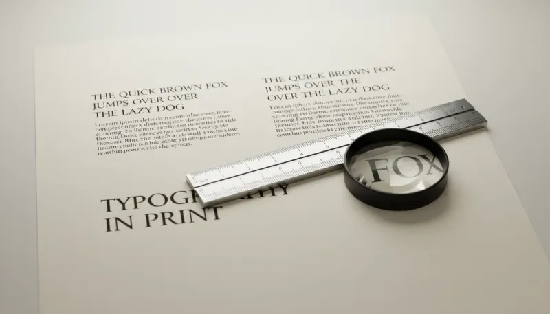
Reading on a backlit screen is fundamentally different from reading reflected light on paper. Typefaces designed for pixels often fail in print. We guide clients on choosing fonts that respect the physics of ink and paper.
Serif vs. Sans Serif in Long Form
For long passages (like books or annual reports), Serif typefaces (like Garamond or Caslon) guide the eye along the horizontal line, improving reading speed and retention. Sans Serif fonts (like Helvetica) are excellent for headlines, captions, and tables but can cause eye fatigue in dense body text.
Ink Traps
In small sizes, ink spreads. Good print fonts have "ink traps"—notches in the corners—that fill with ink to create sharp corners. Without them, text looks muddy.
Optical Sizing
A font designed for a headline looks spindly at 9pt. We use type families with optical sizing to ensure stroke weight is appropriate for the size.
Line Length & Leading
The ideal line length for print is 45-75 characters. Anything longer, and the eye struggles to track back to the next line. We adjust "leading" (line spacing) based on the x-height of the font to create a comfortable reading rhythm.