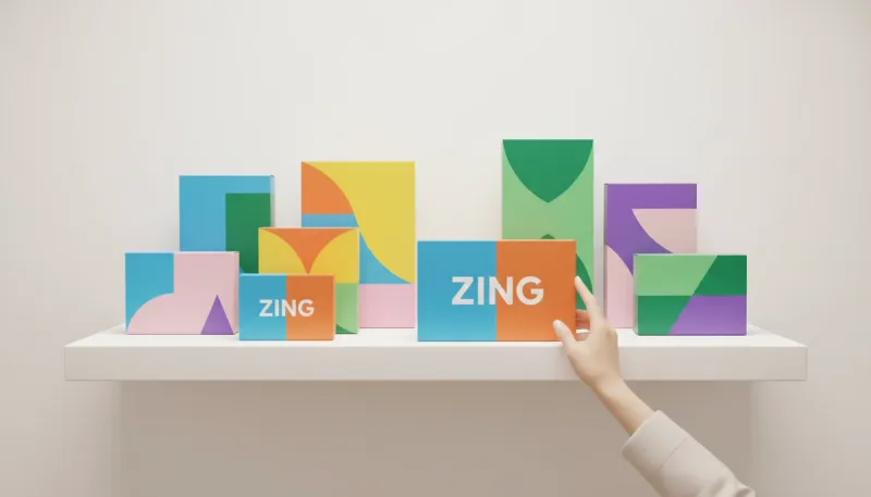
70% of purchasing decisions are made at the shelf. Colour is the primary signal. It communicates flavour, quality, and category before the consumer reads a single word. We help brands hit the right colour notes with precision.
Category Codes vs. Disruption
Every category has colour rules. Milk is blue/green. Coffee is brown/gold. Eco-products are green. You can follow the code to fit in, or break it to stand out (Disruption). But if you break it, you must do it boldly.
Red
Appetite, urgency, energy. Hard to print cleanly without good colour management.
Blue
Trust, hygiene, calm. Common in tech and pharma.
Black
Luxury, premium, masculine. Requires "Rich Black" mixes for depth.
Spot Colours for Brand Equity
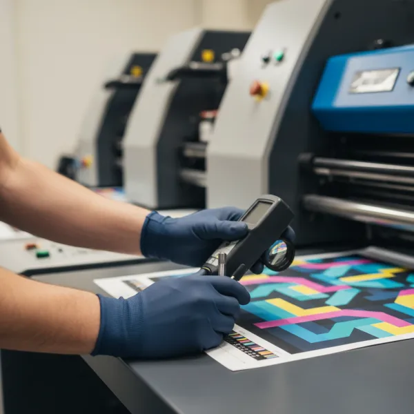
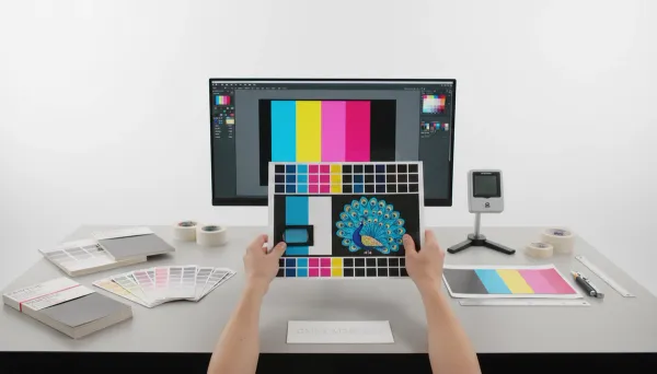
Cadbury Purple and Tiffany Blue are trademarked. For brands where colour IS the identity, we use Spot Colours (Pantone) rather than CMYK. This ensures the colour is chemically mixed and identical every time, regardless of the printer.